Today, we’ll provide you some tools and best practices for making sure that your meetings are impactful, necessary, and accessible to all participants so that meeting with the group doesn’t cost you any momentum! We’ll then follow up with a quick primer on ggplot and how to leverage data visualization for exploring data. While there are many ways of evaluating whether data are useful, visualization is one of the quicker methods. That visualization can also be useful at virtually all other stages of your project is a happy accident of which you can take advantage.
Note Pre-Class Preparation
On your own, consider the following:
What’s one thing your group is doing really well to ensure all team members can participate in meetings and project work?
What’s one area where your team has room to improve its inclusive facilitation practices?
What could you personally be doing better to ensure equal access to participation?
Take notes on your thoughts because we’ll discuss more in small groups and as a class when we cover this module!
Please also identify and download one potential dataset your group is considering including in your synthesis to use in class today. If you haven’t identified any yet, select a dataset from the lterdatasampler to practice with instead.
Instrumental Benefits of Diverse Teams
Tip Learning Objectives
After completing this topic you will be able to:
Identify benefits (and potential costs of) diverse teams
Describe the mechanisms underlying those benefits
Develop ways to mitigate costs of diverse teams
Incorporate practices supporting diverse teams into group practice guidelines
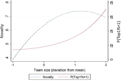
There is good evidence that collaborative teams produce research that is more novel and has higher impact than work produced by individuals or smaller more homogeneous groups (Lee at al. 2015, Hong and Page 2024, Yang et al. 2022). Woolley et al (2010) found evidence for a “collective intelligence” in teams, which is not strongly correlated with the average or maximum individual intelligence of group members but is correlated with the average social sensitivity of group members, the equality in distribution of conversational turn-taking, and the proportion of females in the group.
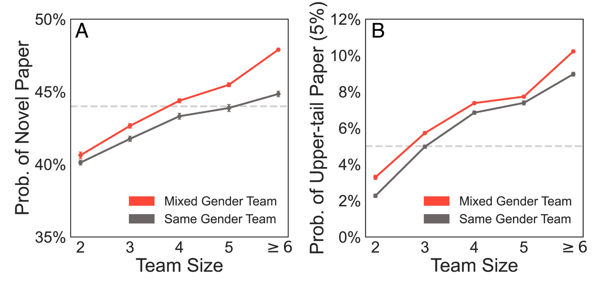
Similarly, in a study of 6.6 million medical research papers, Yang et al. found that mixed gender teams consistently produced more novel and more impactful products. In another bibliographic analysis Abbasi and Jaafari (2013) found that inter-institute and inter-university collaborations resulted in higher-impact publications. Interestingly, the result was much weaker for international collaborations.
Mixed-gender teams are more likely to produce novel papers than same-gender teams at all team sizes. Mixed-gender teams are also more likely to publish an upper-tail paper than same-gender teams by as much as 14.6%, depending on team sizes.
Diversity in career stages can also be beneficial. For example, graduate students play a crucial “networker” role on scientific teams, particularly in connecting different lab groups to each other (Love et al. 2026).
It seems reasonable to expect that the effects of cultural and economic diversity on teams would be similar to that of gender diversity, but those factors remain harder to parse at this scale. In any case, the bump in creativity or publishing impact is only a happy side effect of assembling a diverse team. The real reason to do so is that it allows us to tackle bigger questions, makes our findings more relevant, our science more fun, and our world more fair. What it does not do (at least in our experience) is make the process faster!
A More Nuanced View Emerges
The paradox of team science is that the very factors that slow progress may be exactly the factors that generate new insight – Milliken and Martins’ (1996) double-edged sword. There is recent evidence that even though team science moves slower than traditional science, it doesn’t actually reduce individual productivity as measured by number of publications (Barley et al. 2025). Nonetheless, the pressing question becomes not: “Does diversity improve team performance?” but rather: “How and when does diversity improve team performance?”
What Mechanisms are Responsible for the Diversity Effect?
Information Elaboration
The categorization-elaboration model (CEM, van Knippenberg et al. 2004) proposed that information elaboration—-that is, the exchange, discussion, and integration of task-relevant information and perspectives, was responsible for many of the benefits attributed to diverse groups. But later researchers found there were a few necessary conditions for cognitive elaboration to take place and for groups to reap the benefits. Only when team members brought a learning goal orientation to their work and when they remained open to revising their original ideas (Nederveen Pieterse 2013) did diversity improve team performance.
Avoiding ‘Groupthink’
We are all familiar with the “we’ve always done it this way” effect that can happen when a group of people have been working together for a while. By introducing people from new fields, laboratories, or cultures, that complacent thinking is disrupted. Often, the very act of justifying why we do something the way we do can invite a rethinking and improvement.
Metacognition
Metacognition, or “thinking about thinking” requires individuals to reflect and articulate their process for achieving new knowledge. What information goes in? Is information missing? How should it be analyzed and interpreted? Are those conclusions justified?
In the setting of a group from different backgrounds, that process happens out loud, with multiple opportunities to challenge, re-think, and improve.
Improved Consideration of Alternative Solutions
A science team may include members from different research disciplines, sectors, geographies or cultures. Along each of those axes, team members will have different personal networks and be more (or less) familiar with different literatures, models, communities, tools, and solutions. Collectively, the group has a much broader range of information to draw on…but only if group members feel empowered to contribute.
Better Task Completion & Resource-Use Efficiency
“Many hands make light work” the saying goes. Think of a meta-analysis where 10 group members can each read 30 papers instead of 1 individual reading 300 papers. Dividing the workload can speed up the process, but only if there is an efficient way to manage dividing the work and then bringing the results back together again. Conversely, relying on a few skilled coders can be much more efficient than each individual writing their own code, but unless the group has a mechanism for getting broad input on key decisions, they will lose the value created by bringing together a larger group.
Conditions and Practices that Support Team Functioning
Tip Learning Objectives
After completing this topic you will be able to:
Describe conditions that allow for teams to empower their members through mutual support
In order for teams to reap the instrumental benefits of diversity in membership, teams need to cultivate conditions that encourage all members to contribute at the times and in the ways that they are most skilled and effective. Explore the tabs below for some of these conditions.
Cultivate a learning goal orientation rather than a product goal orientation. Expect to learn from one another and adapt your expectations and plans (Nederveen et al. 2013).
Remain open to revising assumptions and world views. When divergent positions are met only with resistance, groupthink gains the upper hand.
Cognitive trust is the rational belief that group members can and will deliver on their portion of the work. When it isn’t present, group members tend to pull back on their own contributions. Good coordination supports cognitive trust by providing clarity and accountability about who agreed to do what work and whether they delivered. It ensures that contributions can be appropriately credited and that work isn’t unnecessarily duplicated. Effective coordination and facilitation make space for all group members to engage.
Fast and slow processors can be accommodated by making space for written as well as verbal contributions and allowing “thinking time” before expecting a response.
Visual, auditory and kinesthetic learners take in information (and are more or less fluent) in different formats. Try to provide key information (and allow input) in more than one format.
Those with caregiving responsibilities may have unpredictable availability and shorter periods of concentrated effort. A task management system (such as GitHub Projects or Trello) that breaks down tasks into manageable chunks and provides necessary contexts can help them contribute without as much task-switching cost.
Strategies for managing different geographies include virtual meetings, pulsed contributing times, and asynchronous editing of shared documents.
Affective trust is the belief (usually grounded in common experience) that group members have your best interests in mind. Some strategies for building it include:
Spend social time together - meals, activities when in-person, but also, don’t skimp on icebreakers and check-ins when virtual
Pay attention to mutual respect and speaking time. Explicitly acknowledge and credit new ideas as they come up.
Be willing to look foolish. Ask the “dumb” questions that surface unquestioned assumptions. When some (leaders especially) make themselves vulnerable, it provides safety for others to do so.
Consider assigning a vibes-keeper to track when the group becomes impatient, offended, or disengaged.
Spend time early to talk through various perspectives on the question that may be present in the group.
Attend to conflicts as they arise.
All Contribute Some; None Contribute All
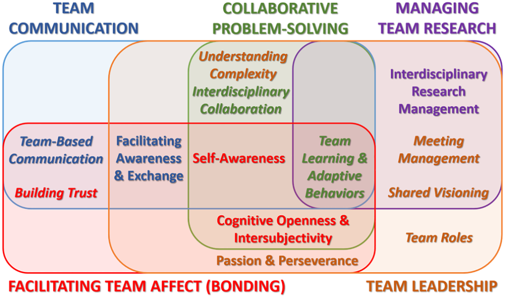
Overlapping and intersecting competencies across the domains (from Lotrecchiano et al. 2021). Colors define the primary domain for each competency.
Come up with one practice that you could include in your group practice guidelines to support each of the above mechanisms.
Information Elaboration
Avoiding Groupthink
Metacognition
Improved Consideration of Alternative Solutions
Better Task Completion & Resource-Use Efficiency
Shift into pairs or trios.
What was one practice you discussed and plan to adopt?
How do you think that will help your group?
Data Visualization for Synthesis
Tip Learning Objectives
After completing this topic you will be able to:
Describe how data visualization fits into the synthesis process
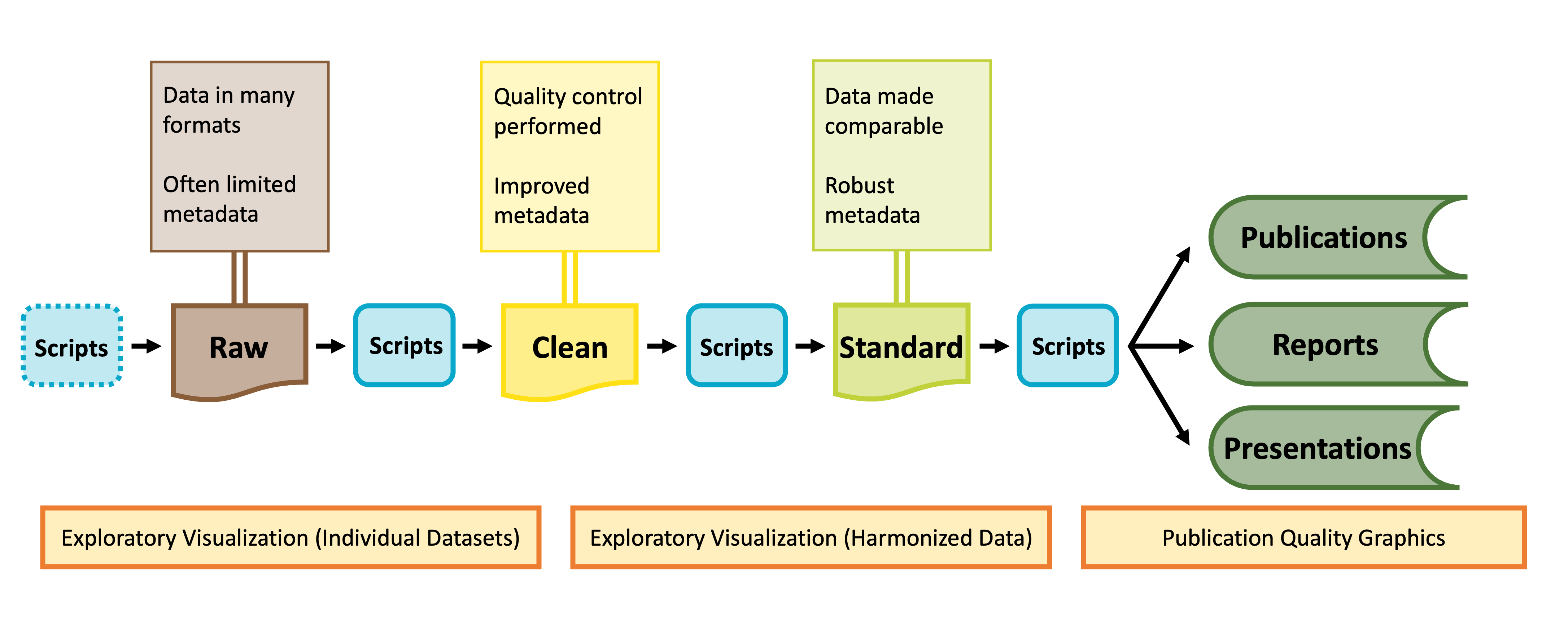
As shown in the graphic below, visualization can be valuable throughout the lifecycle of a synthesis project, albeit in different ways at different phases of a project.
Diagram of data stages from raw data to published products. Credit: Margaret O’Brian & Li Kui & Sarah Elmendorf
Final Pre-Code Step: Draw!
Tip Learning Objectives
After completing this topic you will be able to:
Explain why drawing a graph is a useful step before writing code to ‘actually’ make the graph
It may sound facile, but one of the best things you can do to make your life easier when you ‘actually’ start making graphs is to draw your hypothetical graph. You will likely find that creating a small sketch of your ideal figure will help you make some critical decisions. This can save you time so you don’t laboriously code a graph that–once created–doesn’t meet your expectations. You may still change your mind once you’ve seen the graph your code produces (and that is okay!) but you’ll likely make some of the necessary larger decisions with pen and paper and streamline your process in generating a visualization that perfectly meets your needs.
Warning Activity: Sketch-y Graphing
On a piece of scrap paper, draw one graph you think might be helpful in your project. Then, ask yourself the following questions:
Does the graph make it clear whether your hypothesis is or is not supported?
How / will you identify statistical significance?
What type of graph makes the most sense (e.g., boxplot vs. violin plot, etc.)?
What information is contained in the axes versus stored in other graph elements (e.g., point shape, color, transparency, etc.)?
Graphing with ggplot2
Tip Learning Objectives
After completing this topic you will be able to:
Define fundamental ggplot2 vocabulary
Createggplot2 graphs
You may already be familiar with the ggplot2 package in R but if you are not, it is a popular graphing library based on The Grammar of Graphics. Every ggplot is composed of four elements:
A ‘core’ ggplot function call
Aesthetics
Geometries
Theme
Note that the theme component may be implicit in some graphs because there is a suite of default theme elements that applies unless otherwise specified.
This module will use example data to demonstrate these tools but as we work through these topics you should feel free to substitute a dataset of your choosing! If you don’t have one in mind, you can use the example dataset shown in the code chunks throughout this module. This dataset comes from the lterdatasampler R package and the data are about fiddler crabs (Minuca pugnax) at the Plum Island Ecosystems (PIE) LTER site.
# Load needed librarieslibrary(tidyverse); library(lterdatasampler)# Load the fiddler crab datasetdata(pie_crab)# Check its structurestr(pie_crab)
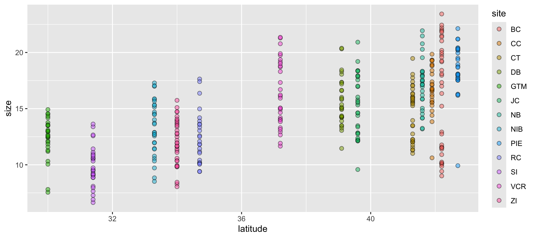
Let’s begin with a scatterplot of crab size on the Y-axis with latitude on the X. We’ll forgo doing anything to the theme elements at this point to focus on the other three elements.
ggplot(data = pie_crab, mapping =aes(x = latitude, y = size, fill = site)) +geom_point(pch =21, size =2, alpha =0.5)
1
We’re defining both the data and the X/Y aesthetics in this top-level bit of the plot. Also, note that each line ends with a plus sign
2
Because we defined the data and aesthetics in the ggplot() function call above, this geometry can assume those mappings without re-specifying
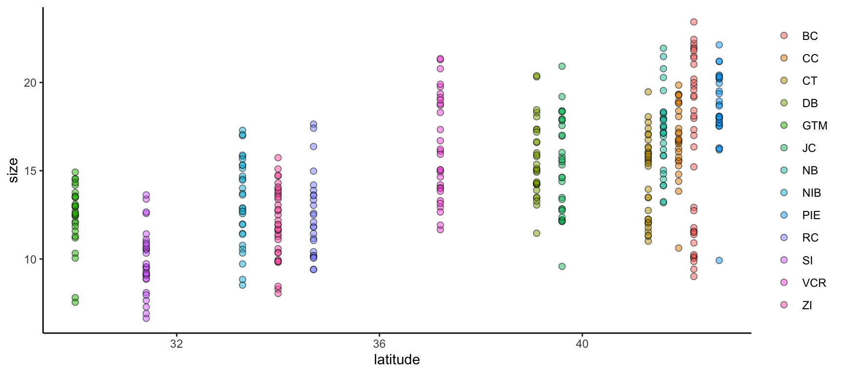
We can improve on this graph by tweaking theme elements to make it use fewer of the default settings.
All theme elements require these element_... helper functions. element_blank removes theme elements but otherwise you’ll need to use the helper function that corresponds to the type of theme element (e.g., element_text for theme elements affecting graph text)
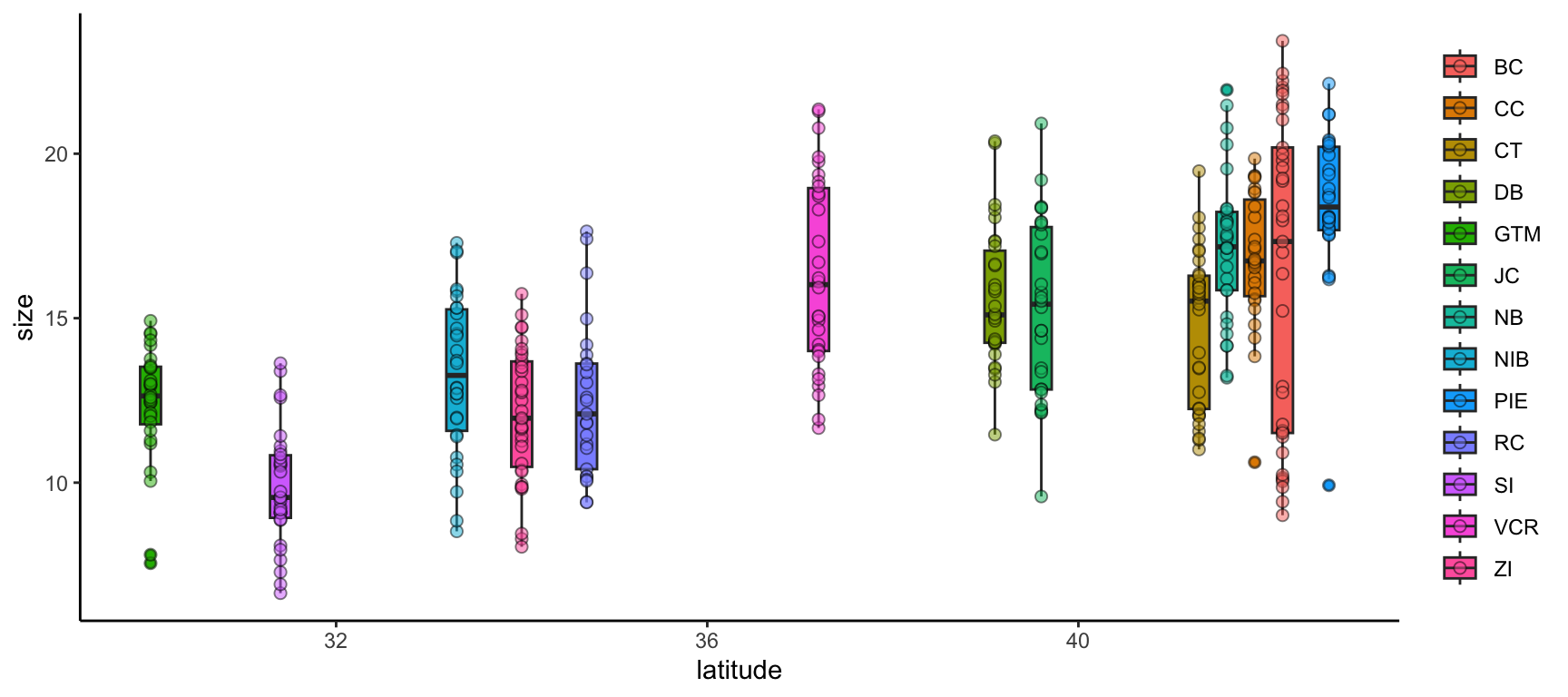
We can further modify ggplot2 graphs by adding multiple geometries if you find it valuable to do so. Note however that geometry order matters! Geometries added later will be “in front of” those added earlier. Also, adding too much data to a plot will begin to make it difficult for others to understand the central take-away of the graph so you may want to be careful about the level of information density in each graph. Let’s add boxplots behind the points to characterize the distribution of points more quantitatively.
By putting the boxplot geometry first we ensure that it doesn’t cover up the points that overlap with the ‘box’ part of each boxplot
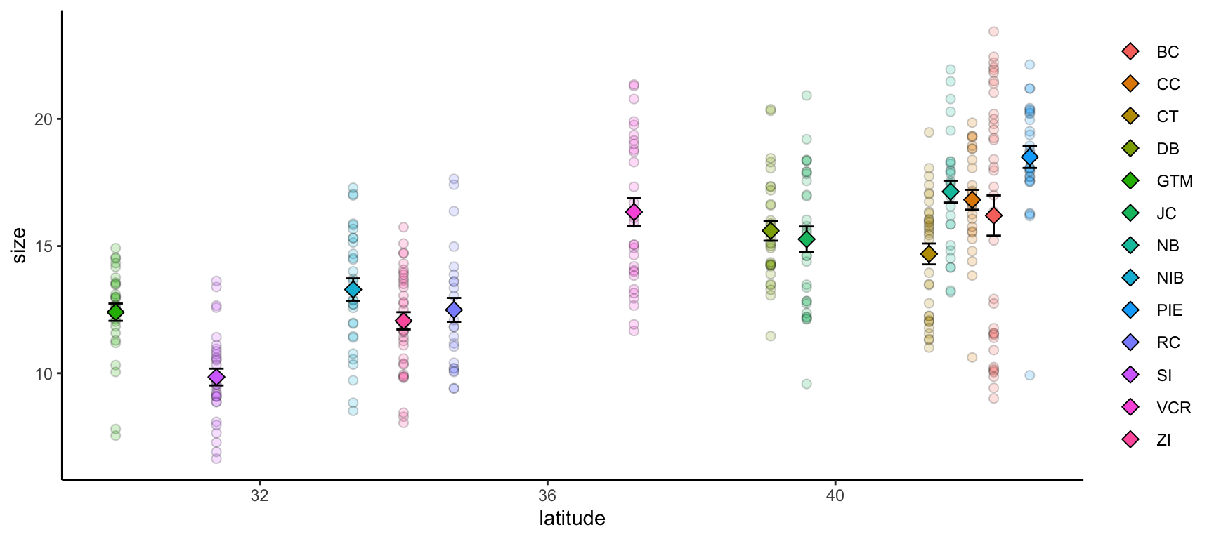
ggplot2 also supports adding more than one data object to the same graph! While this module doesn’t cover map creation, maps are a common example of a graph with more than one data object. Another common use would be to include both the full dataset and some summarized facet of it in the same plot.
Let’s calculate some summary statistics of crab size to include that in our plot.
# Load the supportR librarylibrary(supportR)# Summarize crab size within latitude groupscrab_summary <- supportR::summary_table(data = pie_crab, groups =c("site", "latitude"),response ="size", drop_na =TRUE)# Check the structurestr(crab_summary)
'data.frame':   13 obs. of  6 variables:
 $ site       : chr  "BC" "CC" "CT" "DB" ...
 $ latitude   : num  42.2 41.9 41.3 39.1 30 39.6 41.6 33.3 42.7 34.7 ...
 $ mean       : num  16.2 16.8 14.7 15.6 12.4 ...
 $ std_dev    : num  4.81 2.05 2.36 2.12 1.8 2.72 2.29 2.42 2.3 2.34 ...
 $ sample_size: int  37 27 33 30 28 30 29 30 28 25 ...
 $ std_error  : num  0.79 0.39 0.41 0.39 0.34 0.5 0.43 0.44 0.43 0.47 ...
With this data object in-hand, we can make a graph that includes both this and the original, un-summarized crab data. To better focus on the ‘multiple data objects’ bit of this example we’ll pare down on the actual graph code.
ggplot() +geom_point(pie_crab, mapping =aes(x = latitude, y = size, fill = site),pch =21, size =2, alpha =0.2) +geom_errorbar(crab_summary, mapping =aes(x = latitude,ymax = mean + std_error,ymin = mean - std_error),width =0.2) +geom_point(crab_summary, mapping =aes(x = latitude, y = mean, fill = site),pch =23, size =3) +theme(legend.title =element_blank(),panel.background =element_blank(),axis.line =element_line(color ="black"))
1
If you want multiple data objects in the same ggplot2 graph you need to leave this top level ggplot() call empty! Otherwise you’ll get weird errors with aesthetics later in the graph
2
This geometry adds the error bars and it’s important that we add it before the summarized data points themselves if we want the error bars to be ‘behind’ their respective points
Warning Activity: Graph Creation
In a script, attempt the following with one of either your or your group’s datasets:
Make a graph using ggplot2
Include at least one geometry
Include at least one aesthetic (beyond X/Y axes)
Modify at least one theme element from the default
Multi-Panel Graphs
Tip Learning Objectives
After completing this topic you will be able to:
Describe the difference(s) between “faceted” graphs and “plot grids”
Create faceted ggplot2 graphs
Assemble grids of plots
It is sometimes the case that you want to make a single graph file that has multiple panels. For many of us, we might default to creating the separate graphs that we want, exporting them, and then using software like Microsoft PowerPoint to stitch those panels into the single image we had in mind from the start. However, as all of us who have used this method know, this is hugely cumbersome when your advisor/committee/reviewers ask for edits and you now have to redo all of the manual work behind your multi-panel graph.
Fortunately, there are two nice–entirely scripted–alternatives that you might consider: Faceted graphs and Plot grids. See below for more information on both.
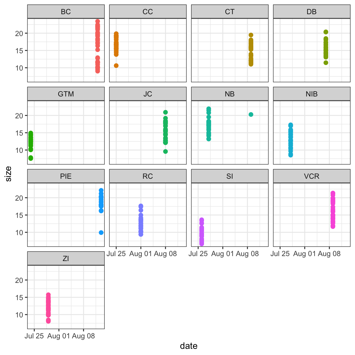
In a faceted graph, every panel of the graph has the same aesthetics. These are often used when you want to show the relationship between two (or more) variables but separated by some other variable. In synthesis work, you might show the relationship between your core response and explanatory variables but facet by the original study. This would leave you with one panel per study where each would show the relationship only at that particular study.
Let’s check out an example.
ggplot(pie_crab, aes(x = date, y = size, color = site))+geom_point(size =2) +facet_wrap(. ~ site) +theme_bw() +theme(legend.position ="none")
1
This is a ggplot2 function that assumes you want panels laid out in a regular grid. There are other facet_... alternatives that let you specify row versus column arrangement. You could also facet by multiple variables by putting something to the left of the tilde
2
We can remove the legend because the site names are in the facet titles in the gray boxes
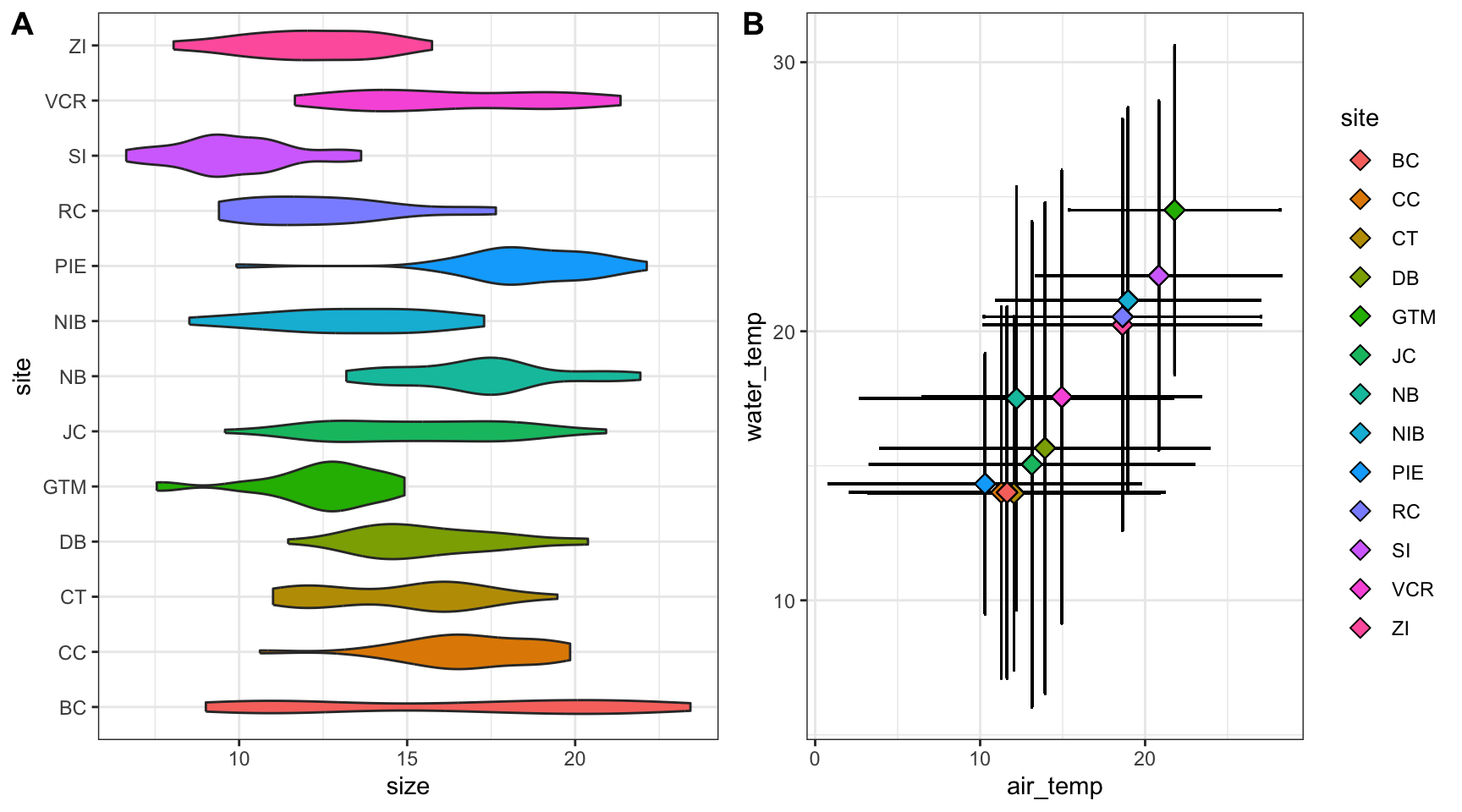
In a plot grid, each panel is completely independent of all others. These are often used in publications where you want to highlight several different relationships that have some thematic connection. In synthesis work, your hypotheses may be more complicated than in primary research and such a plot grid would then be necessary to put all visual evidence for a hypothesis in the same location. On a practical note, plot grids are also a common way of circumventing figure number limits enforced by journals.
Let’s check out an example that relies on the cowplot library.
# Load a needed librarylibrary(cowplot)# Create the first graphcrab_p1 <-ggplot(pie_crab, aes(x = site, y = size, fill = site)) +geom_violin() +coord_flip() +theme_bw() +theme(legend.position ="none")# Create the secondcrab_p2 <-ggplot(pie_crab, aes(x = air_temp, y = water_temp)) +geom_errorbar(aes(ymax = water_temp + water_temp_sd, ymin = water_temp - water_temp_sd),width =0.1) +geom_errorbarh(aes(xmax = air_temp + air_temp_sd, xmin = air_temp - air_temp_sd),width =0.1) +geom_point(aes(fill = site), pch =23, size =3) +theme_bw()# Assemble into a plot gridcowplot::plot_grid(crab_p1, crab_p2, labels ="AUTO", nrow =1)
1
Note that we’re assigning these graphs to objects!
2
This is a handy function for flipping X and Y axes without re-mapping the aesthetics
3
This geometry is responsible for horizontal error bars (note the “h” at the end of the function name)
4
The labels = "AUTO" argument means that each panel of the plot grid gets the next sequential capital letter. You could also substitute that for a vector with labels of your choosing
Warning Activity: Multi-Panel Graph Creation
In a script, attempt the following:
Create two graphs with ggplot2 that have different geometries
Assemble the appropriate type of multi-panel graph
If appropriate, facet one of the two graphs by some grouping variable and re-generate the multi-panel graph from step 2
Visualization for Exploration
Tip Learning Objectives
After completing this topic you will be able to:
Understand the role of exploratory data analysis in ecological synthesis
Practice using data visualization as a tool to explore data
Exploratory data analysis (EDA) is an important part of any scientific project. EDA refers to the process of interrogating the data to understand its contents and identify any issues prior to embarking on the actual science.
These “fitness-for-use” types of investigations are especially critical for synthesis projects, where we are often re-purposing data to answer questions that differ from the original study motivations. As a result, the metadata included with a published dataset may be insufficient to assess whether the data are useful for your group’s question. Datasets may not have been carefully quality-controlled prior to publication and could include any number of ‘warts’ that can complicate analyses or bias results. Some of these idiosyncrasies you may be able to anticipate in advance (e.g. spelling errors in taxonomy) and we encourage you to explicitly test for those and rectify them during the data harmonization process. Others may come as a surprise such as typos, sensor calibration problems, missing data, or differences in the protocol over time.
Simple plots and data summaries are often the most efficient ways to start this process and help you quickly get a sense of the data you have to work with.
Getting started with exploratory data analysis for synthesis projects
Specific applications of exploratory data visualization include identifying:
Datasets vary in when, where, and what they cover. Some of this can be determined by carefully reading the metadata, but often inspection of the actual data is necessary. For example, the metadata might indicate a dataset covers the period 2010-2020. That could mean one data point in 2010 and one in 2020 or continuous sampling over the whole period.
Missing data is another element linked to dataset coverage. Missing data may be random (e.g. in the case of lost samples) or nonrandom (e.g. in the case of values below a method detection limit). In some cases missing data may imply a particular value (e.g. taxa missing from presence-only surveys have an abundance of 0). Datasets may be archived with missing values as explicit (e.g. with NA or -9999 to indicate missing data), or implicit (e.g. where entire dates or sampling bouts are missing from a time-series). Understanding these differences in the datasets you are amassing is critical to developing a robust analysis plan (Rubin 1976).
Do the units “make sense” with the figure? Typos in metadata do occur, so if you find yourself with elephants weighing only a few grams, it may be necessary to reach out to the dataset contact.
In synthesis projects, you are typically combining datasets collected over many sites or many years. As a result, the protocols, or its implementation, may differ over space or time either intentionally or unintentionally. You’ll want to inspect these issues and determine if additional processing is necessary to relativize the disparate datasets into comparable units before combining them for analysis. A benefit of synthesis projects is you will typically have large amounts of data, collected from many locations or timepoints. This data volume can be leveraged to give you a good idea of how your response variable looks at a ‘typical’ location as well as inform your gestalt sense of how much site-to-site, study-to-study, or year-to-year variability is expected. For this type of visualization we generally want to look at whether the data from sequential years, replicate sites, different providers generally fall into the same range and have similar variability. If not, consider whether there is a strong biological reason for the difference, or whether there might be changes in protocols or sensor drift that need to be addressed.
In our experience, where one particular dataset, or time period, strongly differs from the others, the most common root cause is differences in methodology that need to be rectified in the data harmonization process.
In the process of exploratory visualization, you may also find:
Additional quality control is needed (e.g. filtering large outliers)
Harmonization issues
Are all your datasets measured in the same units, or ones that are easily converted?
If not, can you envision metrics or derived variables (e.g. relative abundance, rate of increase or effect sizes) that would make datasets intercomparable?
Careful exploratory data analysis is an important precursor to the data harmonization stage, where you will process the datasets you have selected into an analysis-ready format, including any additional filtering or data transformations you determine are needed. Visualization is a–relatively–easy way of planning for that stage. Visualization also surfaces the ‘unknown unknowns’ that you may not have initially thought to check for in brainstorming possible fitness-for-use and data-quality checks to conduct.
It is also perfectly ok to determine after exploratory analysis that you need to discard parts of datasets or even entire datasets.
Because the figures you make at this stage will typically be used for internal use only, you’ll often want to iterate through this stage efficiently. Aesthetics are less important here than in publication-quality figures, as long as the content is legible. Below we provide a non-exhaustive set of tools that can help iterate through this stage efficiently. If you choose to use AI-tools, make sure to reference the Responsible use of genAI checklist to ensure you’re engaging AI as a learning partner; that security and privacy issues are considered; and that you are documenting your use as you go.
# Load the librarylibrary(summarytools)# Load datadataset_1 <-read_csv("your_file_name_here.csv")# View the data in your Rstudio environmentsummarytools::view(summarytools::dfSummary(dataset_1), footnote =NA)# Alternatively,save the results for viewing later, or to share with your teamprint(summarytools::dfSummary(dataset_1), footnote =NA,file ='dataset_01_summary.html')
1
Careful! Use lowercase ‘v’ in the view function of the summarytools package
# Load the librarylibrary(datacleanr)# Load datadataset_1 <-read_csv("your_file_name_here.csv")# Launch the shiny app and view the data interactivelydatacleanr::dcr_app(dataset_1)
AI tools can be very helpful for EDA and plotting. For small datasets, you may be able to upload the entire dataset into a browser-based chatbot and ask for assistance writing code to conduct exploratory data analysis and generate plots. If you go this route, we recommend downloading the code so you can iterate on it as you work through more datasets and refine your approach.
Any AI-coding assistants (e.g. Claude Code, Codex, Opencode) can produce plots and run EDA. The integration into a familiar IDE can be helpful for going back and forth between manual and AI-assisted coding. There are various options available depending on your IDE. For RStudio/Positron specifically, Posit Assistant is often a logical choice because of its integration with the IDE and data-science focus, as well as its ability to ‘see’ plots in your IDE. As with the R-packages above, the development team has made some tutorials directed at exploratory data analysis. The /eda-log slash command can be used to keep a log of your progress and remaining questions and the /clean mode often works well too for surfacing quality issues and inconsistencies.
Chatbots and AI-coding assistants are also remarkably good at carefully reading the metadata, so providing this context to your AI-assistant improves efficiency.
Warning Activity: Data Sleuth
In this activity, you’ll play the role of data detective.
As a project team:
Draft a checklist or sketch out a few visualizations that would help you assess fitness of use of a particular dataset for your synthesis question.
Use ggplot, datacleanr or an AI code-assistant1 or a chatbot2 to explore one exemplar dataset that you intend to include in your project.
Discuss any issues you discover
Create a “to do” list for the exemplar dataset that details additional steps needed to make that dataset analysis ready (e.g. remove 1993 due to incomplete sampling; contact dataset providers to ask about anomalous values in April 2021)
Decide on a structure for tracking results of exploratory data checks to-do lists.
Git issues? Google sheets or docs? Another collaborative tool?
Note GenAI Disclosure
GenAI assistance was used for layout and formatting of the “Visualization for Exploration” topic in this module.
Prep Work for Next Module
Note Pre-Class Preparation
Before we meet to cover the next module, do all of the work in the callout like this one at the top of that module’s page!
If you go the AI-route, make sure to ask your AI tool to generate code, not just provide an answer, so that you can verify results↩︎
Depending on the dataset size, you probably will not be able to upload the entire dataset into a chatbox. But you can upload a sample and ask it to help generate code that you can run.↩︎


 The real reason to do so is that it allows us to tackle bigger questions, makes our findings more relevant, our science more fun, and our world more fair. What it does not do (at least in our experience) is make the process faster!